 Using color-coding as a means of assisting the shopper in the aisle seems like a logical idea, but is it? In my experience it deserves the classic “yes and no” answer: sometimes it is a good solution and sometimes it just adds noise.
I was inspired to write about this when I came upon a men’s grooming area within the personal care department of a newly remodeled Rite Aid last week. The solution looked good overall in terms of merchandising, adjacencies, and masculine theme, and was likely authored by a major CPG company for this retail account using sound shopper insights and a compelling business case. What caught my attention was an area on the endcap dedicated to helping shoppers navigate the categories within the men’s grooming sub-department with color-coding. Below the “Men’s Grooming” message was a stack of 5 basic colors with corresponding words intended to act as a color-key to the shopping experience. The colors extended to blade signs along the fixture that served as destination markers or “brackets” for each category (yellow=deodorant, orange=shaving, etc.).

Rite Aid Men’s Grooming
This is a great example of color-coding not adding value to the experience. The presumption is that the shopper will take time to associate colors with categories, commit them to memory, use them to navigate as they go around the two-sided fixture, and even possibly build a multi-item basket by shopping every color. This is unrealistic behavior in this category and many others because It doesn’t pass the “would YOU do that?” test. Yellow, blue, red, orange, and green color-coding might have some utility if they were shopping for fruit-flavored candy (because of sensory associations), but have no association with this merchandise… and neither would another set of colors. In this case color-coding is not appropriate whereas literal photographic or illustrative solutions would be more effective communicating categories. Additionally, a more visually compelling solution would illicit a positive emotional response which could stop more shoppers.
The reason color-coding can be a miss is because colors have meaning and the brain seeks meanings that make sense. Colors can be strongly related to the category (as I have referenced for flavors), potentially have strong brand associations (like orange for Tide detergent), or have a cultural/social currency (like green for environmentally responsible). Colors out of context are at best noise and at worst confusing. Our brains will spend a small amount of time unconsciously trying to rectify the colors with the circumstance, but quickly abandon the job if it is not immediately clicking. In the Rite Aid example shoppers’ brains likely dismiss them as junk communications. They can adequately rely on product packaging and product forms on the shelves to identify the categories. The type on the blade signs provide clear communications of what merchandise is out of view and where categories begin and end. In this case the color does not provide value and becomes mere decoration.

Hardware fastener aisle
In contrast, an appropriate use of color-coding is when the nature of the merchandise itself does not signal key category breaks or product applications, as often seen in hardware. In an example of an aisle of screws and nuts, invisible details like thread type and hex heads versus slotted heads are important to the shopper. Here the shopper is willing to invest in understanding the color-coding on the fixtures because it saves them time and frustration. The packaging (from a single vendor in this case) corresponds to the fixture color so it is an integrated solution. The actual colors are inconsequential, and another retailer or vendor may successfully use different colors, as long as they provide the same organizing utility. There is also little or no impulse or emotional element in shopping for nuts and bolts, so the color-coding is enough to provide a great experience.
These are admittedly “man-centric” examples, but you will find similar good and bad examples across all categories, including women’s skincare. Here is a cosmetics display that uses the warm/neutral/cool color-coding system to organize shades. In this situation, even though the packaging shows the true colors, the visual differences of the products are not adequate to build purchase confidence for the shopper. The color-coding helps shoppers stay within shade groups based on their unique needs.
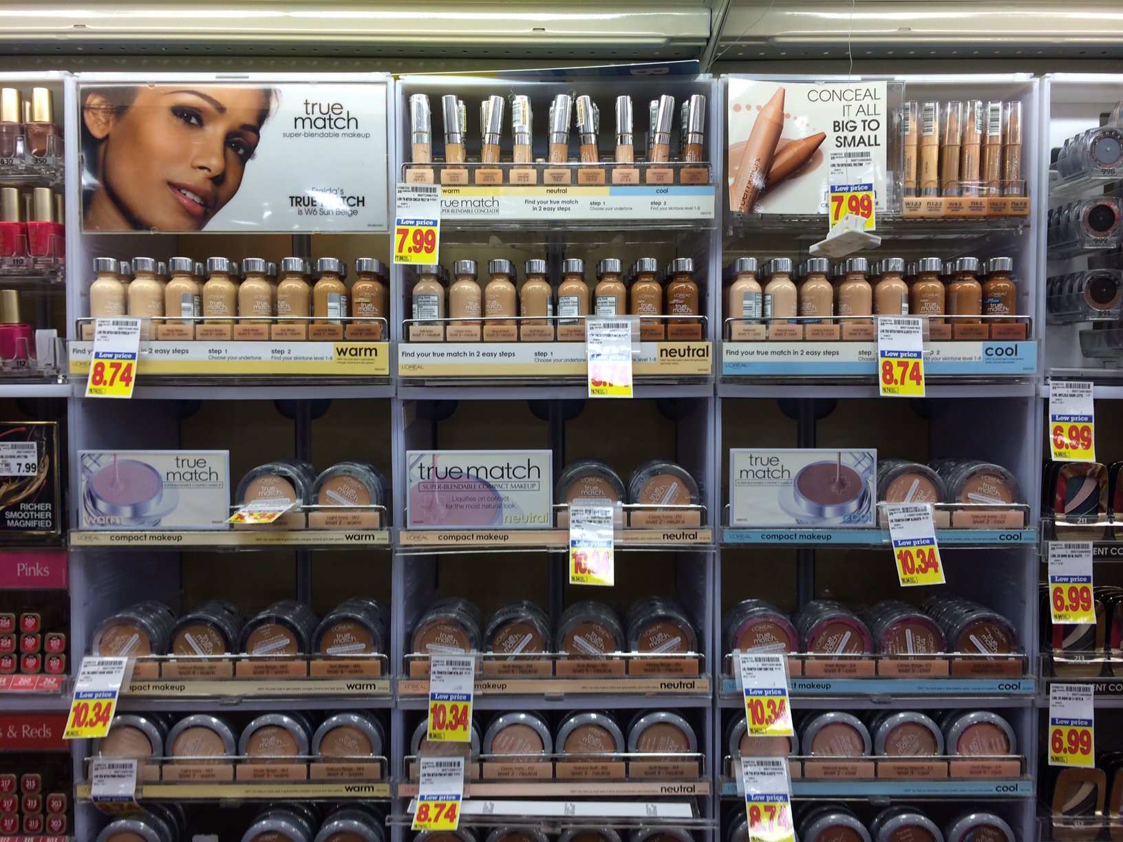
Cosmetic display with effective color coding
Before venturing down a path to color-coding as a navigation tool for your shopper experience, think about the following checklist.
Color coding is a great shopper tool when:
- The product variations are not immediately evident by product or packaging form or other high-priority packaging communications. (Nuts and Bolts, Light bulbs, batteries, etc.)
- Cultural or social color associations exist in the categories that may be stronger than the dominant brand colors or product/packaging signals on the shelf. (Orange for de-caffeinated coffee, green for eco-friendly, pink for little girls/blue for little boys, etc.)
- The understanding of compatible products is important to enable shopping for system components (Smartphone or game console accessories, and the cosmetic example above).
If your categories or departments do not have any of these three challenges, you are probably going to find color-coding less effective and should look for other ways to manage navigation. Color is powerful and if you don’t need to use it for navigation, seek to use it for another purpose that evokes a mood, creates disruption, or projects an attitude.
Bill Chidley is a Branding and Experience Design Consultant with over 29 years of experience.

Bill: I try to follow color coding in retail where I see it, for good and for ill. You and your readers might be interested in some of my findings by Title of visually on Pinterest Board. See…
http://fixturescloseup.com/index-color-coded-retail/
LikeLike